Ecoparency
.png)
Overview
Ecoparency is an app that help Gen Z to purchase sustainable clothing, by clearly highlighting why the clothing brand and its products are sustainable through two distinct steps with transparent information.
Project Type: Individual Capstone Project
Tools:
Figma (Wireframes, Rapid Prototyping & User Testing, Mockups)
Adobe Illustrator,
Photoshop ( Wordmark, Logo Design)
Microsoft Office,
Material Design Color Tools (Accessibility)
Duration: 8 Weeks ( December- January)
Role: UX/UI Designer
Problem Space
Problem Space
People are eager to purchase sustainable clothing but faces obstacles. Their interest is marred by a lack of knowledge about sustainable brands, leading to difficulty in distinguishing these options from regular fashion. This gap in awareness presents a challenge in making informed, eco-friendly choices within the fashion industry.
Solution
As a solution, I designed an iOS app that helps Gen Z purchase sustainable clothing by clearly highlighting why the clothing brand and its products are sustainable through two distinct steps with transparent information.

Design Thinking Methodology
Throughout this project, I applied the design thinking methodology from the very beginning to the end because it helped me focus on users, solve problems effectively, iterate on solutions, understand users better, be innovative/ creative, and illustrate my process clearly.

"
This problem space aligns perfectly with my background. With extensive experience in the fashion/e-commerce industry, which has gained prominence lately, I am well-suited to address the pressing need for sustainability. It has become a pivotal requirement within the fashion sector, and I am ready to tackle it head-on.

Secondary Research
Then, I conducted secondary research to gain a deeper understanding of the problem space. According to my research findings, it was highlighted that Gen Z shows a keen interest in purchasing sustainable clothing yet faces several challenges. Research indicates that:
Problem Statement
After conducting my secondary research, I formulated the problem statement.
"Majority of Gen Z individuals show heightened interest in purchasing sustainable clothing. Approximately 44% of Gen Z is willing to pay more for sustainable garments, but 83.3% of Gen Z cannot even name a sustainable brand and end up buying from fast fashion options"
Hypothesis
I believe that Gen Z individuals find it challenging to properly identify sustainable brands and products, despite their interest in purchasing sustainable items, due to a lack of information provided by brands and their own knowledge. I will confirm my hypothesis when two-thirds of my interview participants express difficulties for these reasons.
My next step is to conduct primary research to gather broader information that will aid the design process, enabling me to make more well-informed decisions eventually.
After analyzing my secondary research findings, I made the decision to concentrate on a specific demographic: Generation Z. Subsequently, during the primary research phase, I chose to align with the same target user group. The following are the prerequisites that potential interviewees need to meet in order to qualify for participation in the interview:
-
Must belong to Generation Z (born between 1997-2012).
-
Actively engaged in promoting awareness about sustainable fashion.
-
Regularly utilize digital platforms for shopping.
-
Represent diverse economic backgrounds.
The Interviewees

Interview Insights
After conducting secondary research and interviews, I categorized key insights into pain points, motivation points, and behavior points. The gathered notes were organized under three themes: Transparency, Affordability, and Resources.


How Might We
How might we enhance transparency and clarity regarding the sustainability of garments and brands, so that environmentally conscious Gen Z individuals are motivated and feel more confident when purchasing sustainable clothing?
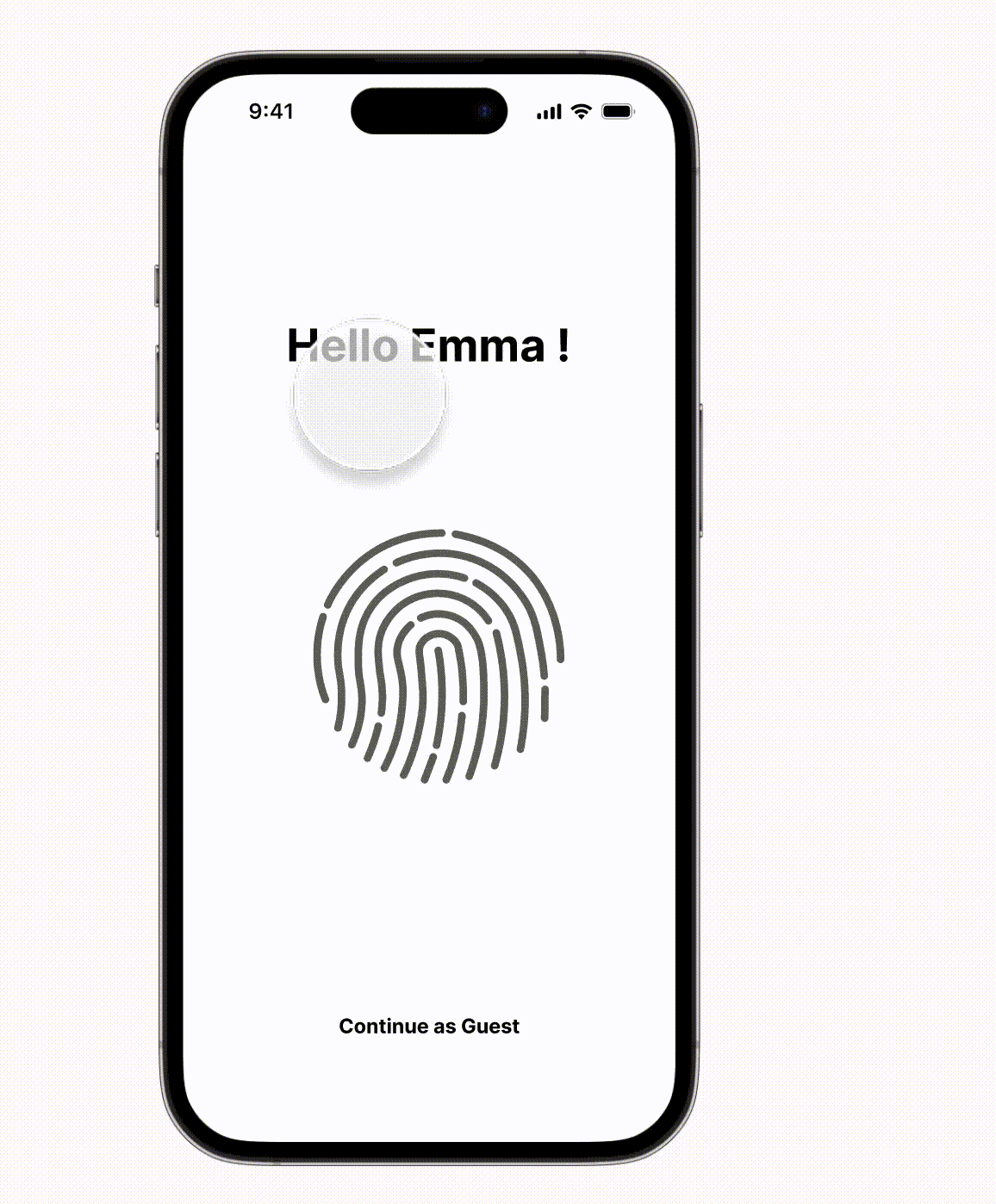
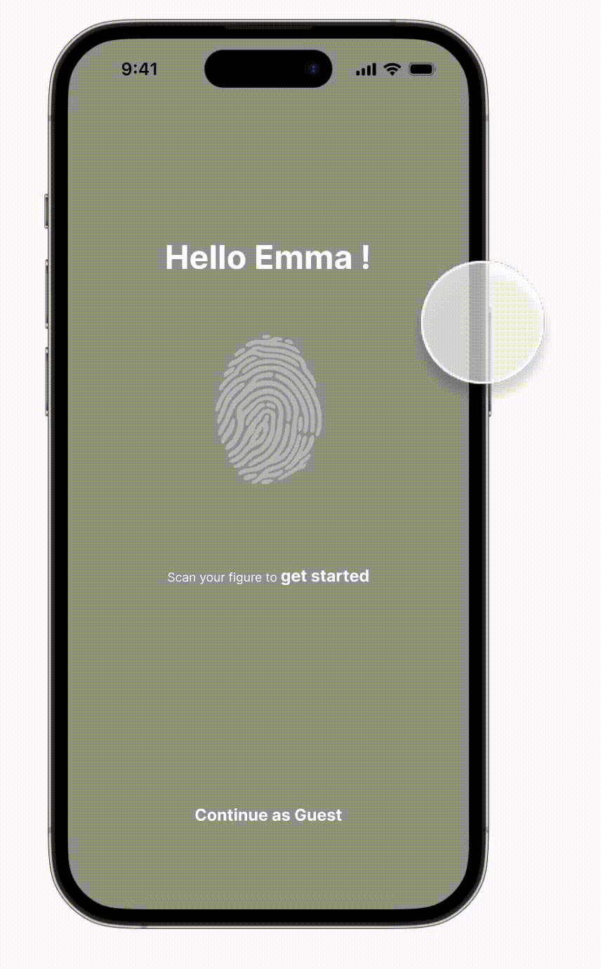
Meet the User
I conducted thorough secondary and primary research to develop the persona, a critical step in comprehending and designing for the target audience. This approach facilitated the creation of more effective and user-centric solutions.

I created an experience map tailored to Emma, a prospective dress buyer with a focus on purchasing sustainable products. This method allowed me to visualize and analyze the entire user journey comprehensively.
.png)
Prioritizing Key User Stories and Epics
After analyzing Emma's user journey, I expanded on several user stories related to this specific task. I then decided to select 'Purchase Sustainable Clothing' as the epic, along with these three main user stories to focus on.
.png)
Building A Task Flow
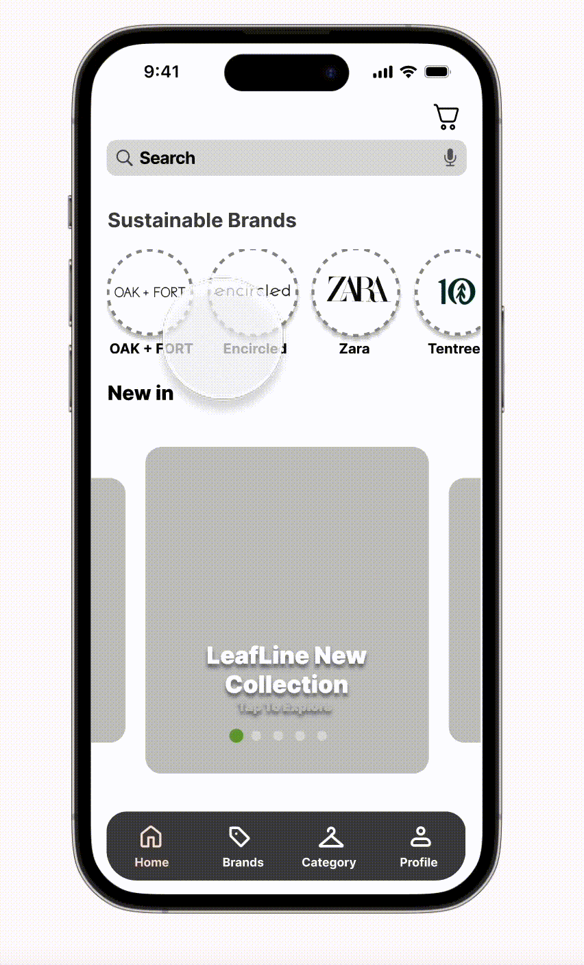
I developed a task flow after selecting user stories and epics, focusing on purchasing a sustainable dress. This process aimed to translate the task into a detailed, user-friendly digital solution.

I curated UI elements and design patterns for building iOS-aligned screens, influenced by my aspirations for future app development. Beginning with an inspiration board, I crafted exploratory and solution sketches to guide the process.
.png)
Enhancing Product Usability through Iterative Design
After creating mid-fidelity wireframes, I conducted 15 test sessions across three rounds of user testing. These sessions utilized an interactive mobile prototype, guided by a script designed to elicit valuable insights. Users were assigned various tasks and provided constructive feedback on the app's logic, functionality, and usability."
"


Version 4
Version 1
Version 2
Version 3


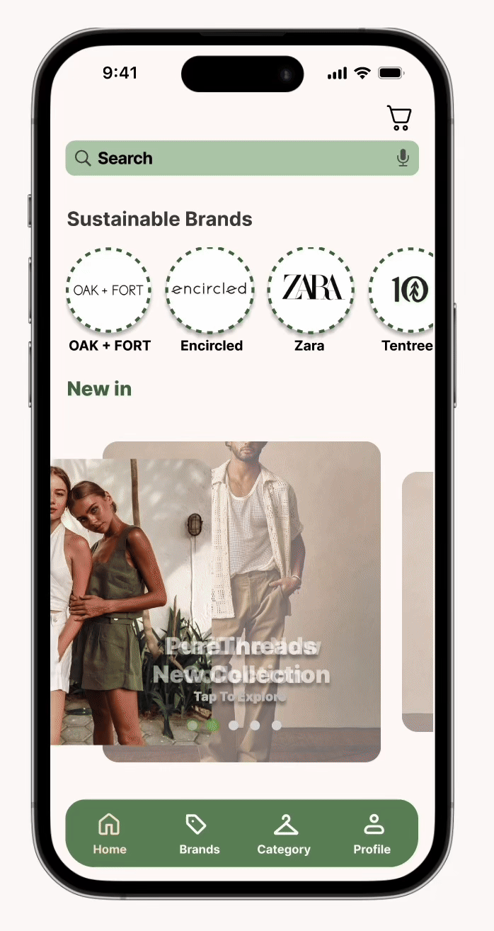
Moodboard
With Ecoparency's ideals in mind, I curated keywords and visuals to shape a mood board, followed by crafting an initial color palette from extracted hues. After refining color schemes, I settled on earthy tones for ethical resonance. Experimenting with pairings, I established the brand's definitive colors.
As for the app's typeface, Inter was chosen for its minimalist appeal, reflecting sustainability. The app's wordmark, with modified "O"s, reinforces this ethos. For a more comprehensive understanding about brand development, please refer to my brand development project.
.png)
.png)
"Dark & light mode versions of the wordmark for the brand 'Ecoparency'."


I finalized my color palette, incorporated its colors into my design, and conducted user testing to select the best option, ultimately choosing the third option. Additionally, a study revealed that 65% of Generation Z individuals prefer using light mode on their devices.
Taking accessibility into account
I ensured that the app's layout and color schemes are inclusive, meeting Web Content Accessibility Guidelines (WCAG) Level AAA standards for main content and CTA buttons. By adhering to WCAG, I adjusted hues to enhance aesthetics and inclusivity, selecting colors based on guidelines for icons, text sizes, and buttons.
.png)
Used for Icon/ Text
Used for Large Buttons/ Icons
Used for Text
Used for Access Color
Used for Icon/ Text


Building A Marketing Website:
Responsive for both Mobile & Desktop
A marketing website is essential for promoting a mobile app, enhancing visibility, informing users about features, building trust, and supporting marketing efforts. I developed both mobile and desktop versions of a marketing website for the Ecoparency App, incorporating specific sections like a logo, navigation, hero section with descriptions and calls to action, product features, testimonials, performance metrics, and Instagram galleries to promote my sustainable clothing purchasing app.
Next Steps
Furthermore, I aim to enhance accessibility and smoothness of the experience, while also exploring additional features to enhance the process.
