
Art Gallery of Ontario
Overview
In this project, the usability of the Art Gallery of Ontario website was assessed through a heuristic evaluation. Subsequently, usability recommendations and design enhancements were implemented. Screens within the ticket purchasing task were then redesigned based on the findings from the heuristic evaluation and usability recommendations.
Project Type: Group Project
Tools:
Figma (Wireframes, Prototyping & Mockups)
Material Design Color Tools (Accessibility)
Duration: 2 Weeks November
Role: UX/UI Designer
UX/ UI Design Strategy, UX Research, and Branding

AGO's branding adopts a minimalistic approach, characterized by generous white space and vibrant pop-art colors such as pinks, yellows, and blues. Typography-wise, AGO employs Knockout for headings and subheadings, while Arial is utilized for body text. The logos maintain simplicity, featuring the gallery's acronym in all caps, with pink and white color schemes for top navigation elements and black and white for footers.

During this project concerning the AGO site, we focused on 10 usability heuristics and identified violations related to user control and freedom, consistency and standards, as well as error prevention.

Within this project, the task flow for purchasing a ticket will be reviewed, and design solutions will be implemented accordingly.
Let's Take a Look at the selected Task Flow: Purchase A Ticket

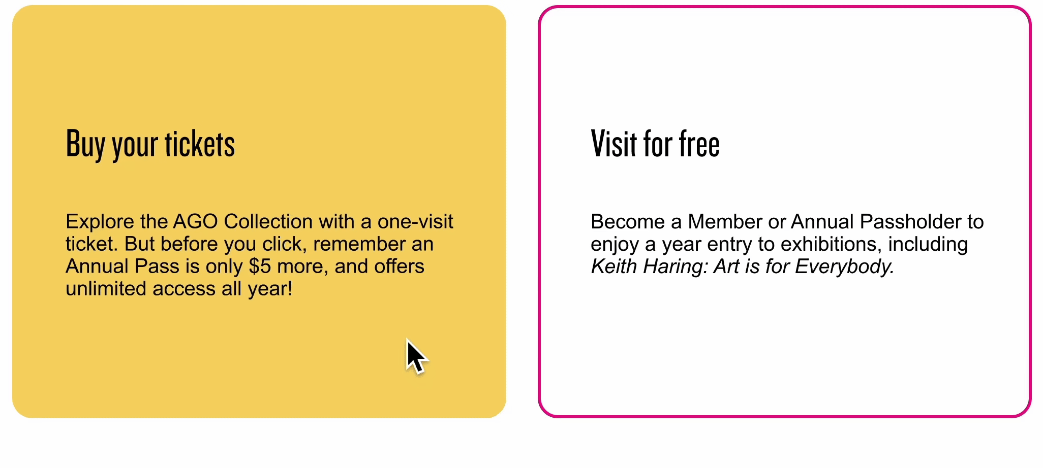
Usability Heuristic Violations 01


A minor usability issue was identified on the 'Book Your Tickets' card, potentially leading to confusion for users who might accidentally click non-responsive areas. To address this, proposed solutions include enlarging the touch target to encompass the entire card and adding hover states for "Buy your tickets" and "Visit for free" to enhance user awareness of the card's selectability.
Usability Heuristic Violations 02


A significant usability issue was discovered on the date picker screen due to the unclear "Admission" label, leaving users uncertain about their next steps. To address this, we updated the call-to-action label to "Buy Tickets," offering clear and direct language. Additionally, we introduced a hover state to draw attention to the CTA, guiding users through their journey.
Usability Heuristic Violations 03

A cosmetic usability concern arose from the absence of a Back button, resulting in users lacking an intuitive option to correct mistakes. To address this, a "Back" button was added beneath the shopping cart details. Additionally, hover states were introduced for all CTAs, including "Update Quantity" and "Clear Cart," to maintain consistency with previous design enhancements.

Usability Heuristic Violations 03
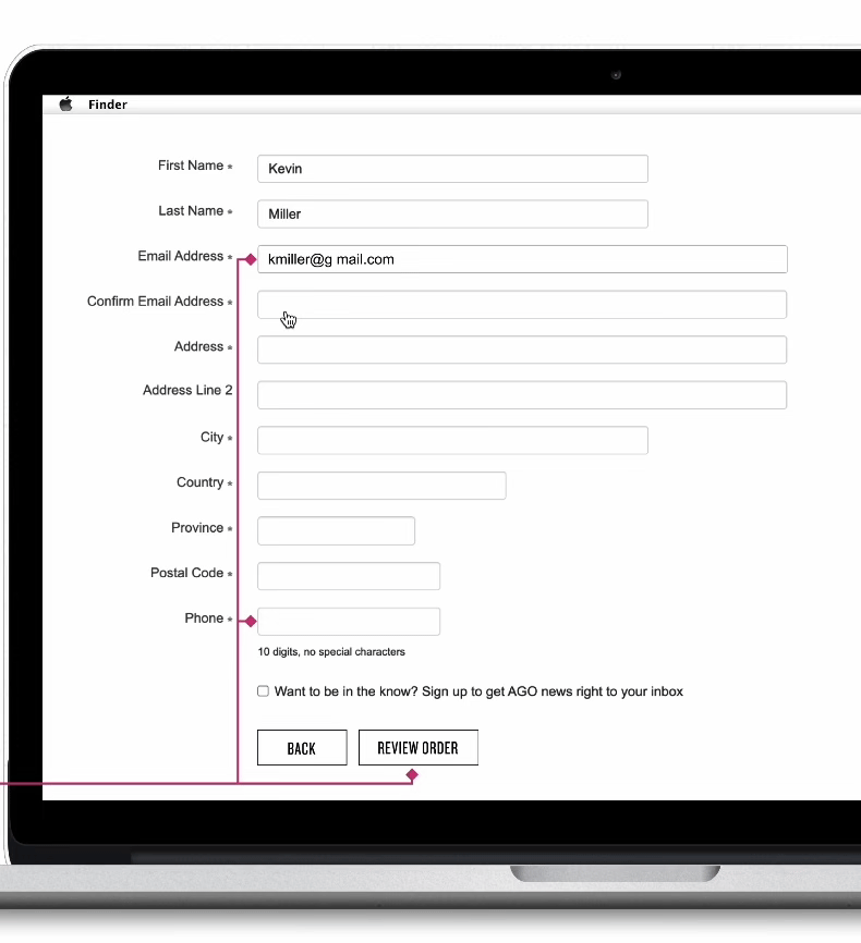
Usability Heuristic Violations 04

A major issue was identified in the checkout form regarding error prevention and ineffective email validation. Users were notified of errors only after completing the form, allowing them to proceed despite an incorrectly formatted email. To rectify this, real-time error prompts for immediate correction were implemented. Additionally, the email validation process was enhanced by introducing inactive and active states for the "Review Order" CTA, ensuring users can proceed only when all fields are correctly formatted, thus facilitating a smoother checkout process.

Thanks to improvements made in the checkout form, users can now confidently submit their orders. The risk of not receiving confirmation emails has been reduced due to a stronger system validation process. As a result, the Confirm page now successfully passes the Error Prevention heuristic.
